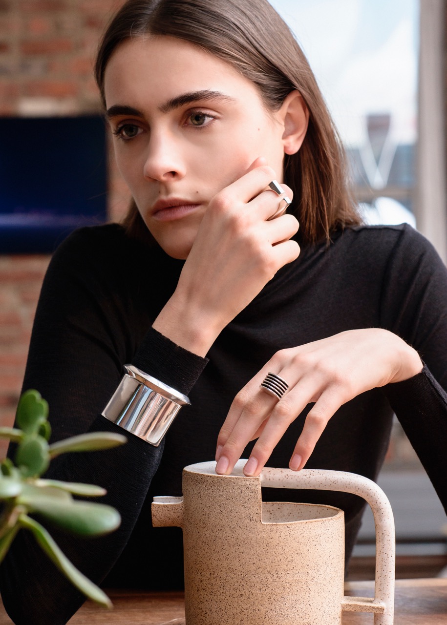
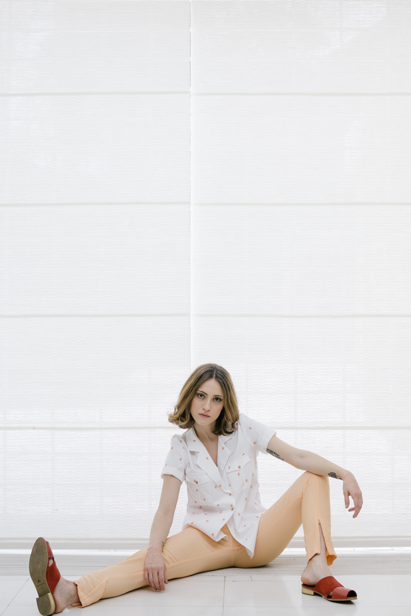
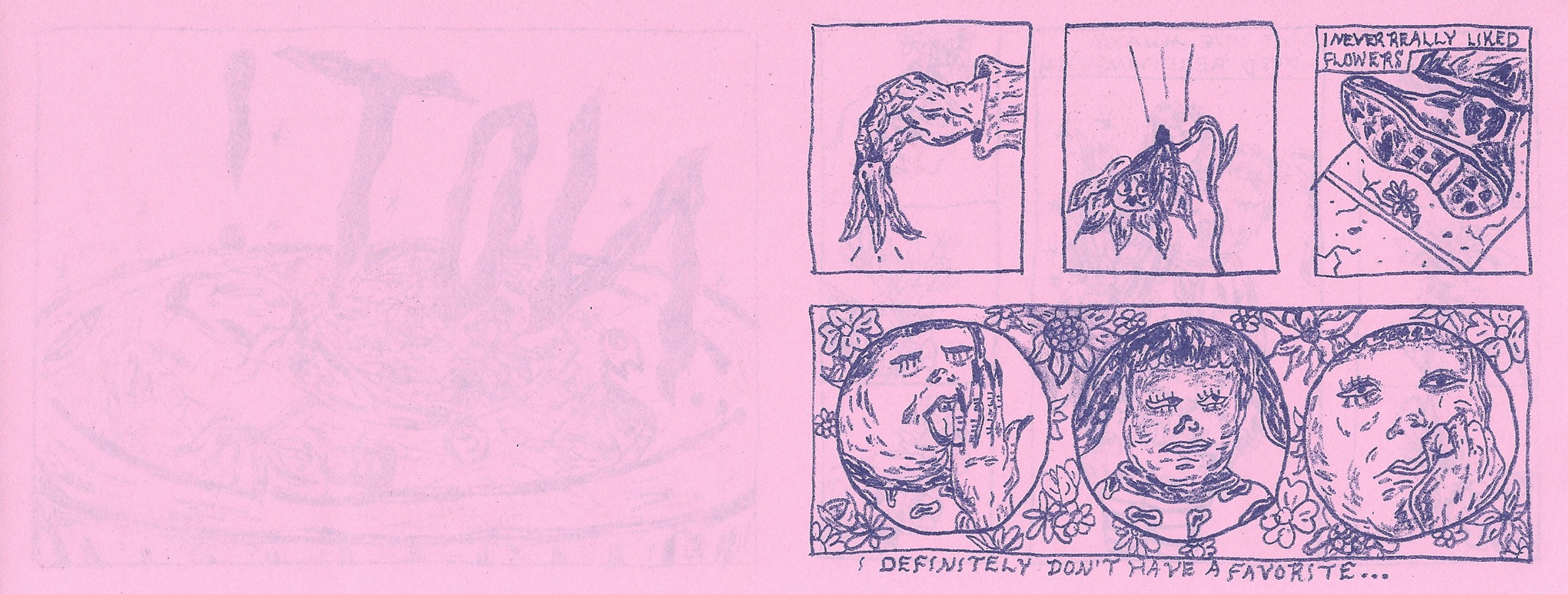
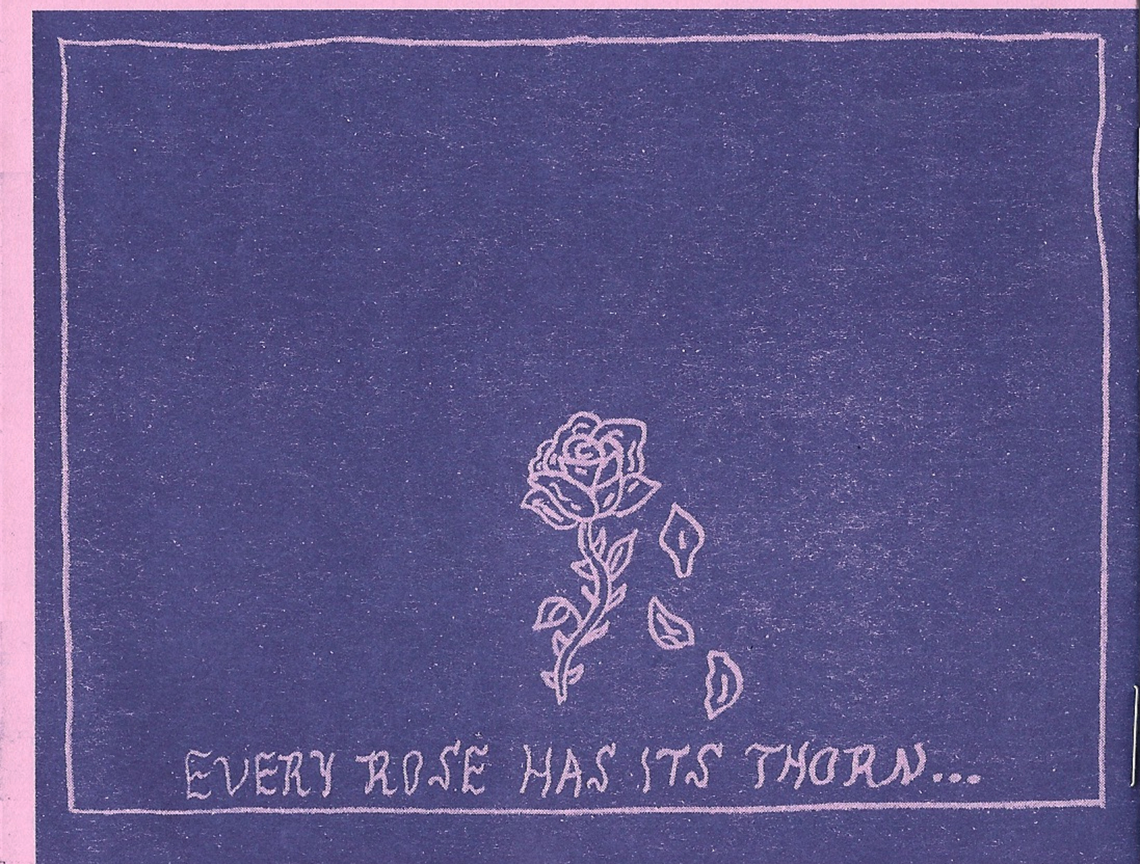
small talk // caroline griffin // full moon workshop + girl gang pdx
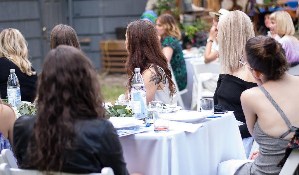
people can come into your life in some unexpected, magical ways. cultureisland taught me to stay open to that always. i first found caroline griffin's work through her instagram account, @girlgangpdx. there, she shares inspirational images and text that resonates with me. i am constantly screenshotting the stuff she shares. she just gets me. when i learned caroline also runs a supper club and events project in portland, AND was hosting one the weekend i was going to be in portland, i knew it was fate. caroline invited me to join, and write a poem about the supper club's theme, abundance. the event was magical, every aspect was special, and i loved taking in every detail of the experience while participating in a less active role than i was used to -- here i share the poem i wrote, and chat with caroline about her inspirations, struggles, and learnings.
--
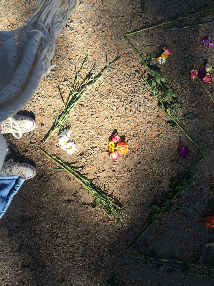
tonight we welcome you to an evening of abundance.
what does it mean to live in abundance? to be abundant means to be plentiful, to be large, to be great. to be full.
here, allow yourself to feel full of life's wonder, mystery and curiosity.
here, allow yourself to feel free from expectations of yourself, and of others.
here, allow yourself to find confidence in your vulnerability, mistakes, and life's greatest uncertainty.
here, allow yourself to never stop learning, to ask questions, to think deeply.
here, allow yourself to feel full of light, energy and life.
tonight we invite you to bask in the warmth of your own bright and shiny soul. as well as that of your neighbor's.
you may have forgotten. you may not even realize. but you are beautifully abundant. and i hope, now, that you never forget that.

cultureisland: tell us more about you.
caroline griffin: when i moved to ny in 2011, i decided i was going to teach myself to draw. i bought a pack of colored pencils from the art store off the graham stop and daily spent about 1-2 hrs drawing. a year later was offered a job at boddington's studio and realized that i didn't want to spend my life doing just one thing, all day. i lived in bushwick, brooklyn on cornelia street and my apartment was a live/work space we called atelier cornelia. i taught myself to draw, expanding into custom stationary and wedding suites, illustrations for businesses, events etc. the illustration market allowed to expand into more tangible stylistic opportunities, styled shoots and creating, design space. ultimately, my desire for tangible experiences, not just visual arts motivated me to create an experience with a longer lasting impression. i wasn't fulfilled by the simplicity of work.
sometimes, major life change is the catalyst to major break through. i journeyed through one of the most difficult times in my life, rebuilt my life and stability from the ground upward. i moved back across the country to pdx, searched for a stable place to live and work and i dove into connecting with friends, collaborating on projects to find some source of release. there is a lasting impression with human relationships, co-creation and the power of collaboration - thus the retreat the full moon gathering workshop was created to give women, my peers, an opportunity to connect, do some emotional work, inspire creative growth and benefit from a new network.
cultureisland: tell us more about girl gang pdx.
caroline griffin: girlgangpdx is social media account dedicated to soulful inspiration and heartfelt encouragement of women and girls everywhere. it was initially inspired by kate nash's girlgang network out of la and it's grown into an online community. at the heart of the project is that it's a mood board of what inspires aesthetically me and what is emotionally, socially and creatively relevant to me. i celebrate women i think are inspiring, i share passages that i feel are benefit for all to have read at least once. its a place of transformation and its genre is ambiguous, posts shifts and changes as i evolve and the freedom in that is awesome.
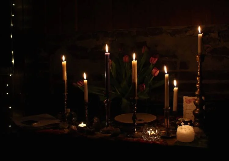
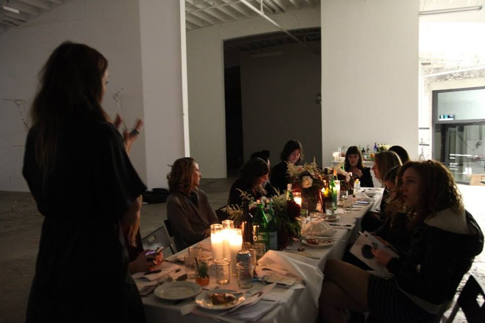
allison burt-tilden // alter created by psychic siamese terror at the full moon gathering workshop march 2015
cultureisland: tell us more about full moon workshop.
caroline griffin: the concept originally was a 2-3 day retreat with the purpose of gifting women time and space to expand, pursue new dreams, relationships, friendships, and be guided to take action in leaving the old shit behind - the stuff that doesn't work. it was a weekend of breakthroughs at a the beach, at the sou'wester trailer park hotel and lodge in illwaco, washington. this amazing space allowed us to come in, take over the big red lodge and "make waves" with cool babes. after some tweak-age, the concept evolved into a supper club platform the plan was to host events in la and pdx. this platform offered us something more accessible, a condensed version of the retreat that allowed more women to come for a lower cost with less time commitment away from work, and responsibilities.
as of today, were leaping into uncharted territory! jessica yelas of style opal and i are taking the idea to whole new level. wish us luck! full moon gathering workshop was a co-created, collaborative experience the women who attend make the experience what it is. the elements of magic, astrology, communication, discussion and the mini-workshop activities incorporated make the "working meal" transformative on many levels. its not so much about the woo-woo anymore, but rather an introduction to tangible ways of self and life improvement, no-bullshit, come as your best self and make real connections to do what you really love in life. the partnerships, businesses, friendships, creative opportunities that have come from it are nothing short of awe-inspiring.
kara jean caldwell // full moon gathering workshop may 2015
cultureisland: what is your process for creating events?
caroline griffin: anything that inspires me and whatever i am drawn to organically are my sources for event creation. i create experiences and dream up events i can't find. i look to create experiences that offer guests, participants a multi-sensory experience: touch, sound, smell, taste and feeling. i like events with multiple facets, be that vendor partnerships, collaboration, theme, color, sound or activities. i want events to have movement, an unpredictable (but realistic) flow, keeping people engaged. i don't think that is an easy task by any means and i am bored by the concept that food, alcohol and a cool venue are the only thing that draws a cool crowd. people want to experience new things. not to mention, i am sober almost two years now and i don't give a shit if there is beer or wine. i want to feel inspired by what i choose to go to, and i hope others are inspired by the events i orchestrate.
full moon supper club la // december 2016
cultureisland: what lessons have you learned from organizing collaborative experiences?
caroline griffin: don't do business with your best friend. mixing professional and deeply personal relationships doesn't always work out. don't compromise your ideas, your heart or your desires for the sake of an event. be vulnerable, talk, challenge yourself and meditate on other peoples ideas before you allow your ego to speak. be brave. always adapt! make a contract, or document explaining each person's roles and what each collaborator is supposed to give to the job. leave no room for assumption about involvement. i've learned that experiences like the supper club - no matter how cool the concept has its own difficult challenges. the cost was a big one! our overhead was astronomical, like $250.00 a head for all parts and pieces. however our research showed that people would likely not pay more than $65-$85 a seat. it's rough finding ways to work within your means and encourage people to see the benefit in your offering. portland, as quickly as its growing still faces a challenge in convincing young people that art and live experiences are worth paying for.

maria luna - full moon supper club la // april 2016
cultureisland: what words you life by?
caroline griffin: celebrate, support, inspire but mostly i live in a constant state of gratitude.

annika bielig-bußmann // full moon supper club pdx july 2016
cultureisland: what was your experience like organizing the abundance event?
caroline griffin: logistically, events can be a shit show. like an hourglass, time is ticking away quickly, counting down to go time and i just hope all the pieces fall into place. live events are unpredictable, something always go awry but its a coordinators ability to adapt to those last minute challenges that make it fun. the process of development is always fun, my favorite part is creating the concept, selecting the theme, writing materials, designing the schedule and the way the partnerships intertwine into the experience.
annika bielig-bußmann // full moon supper club pdx july 2016
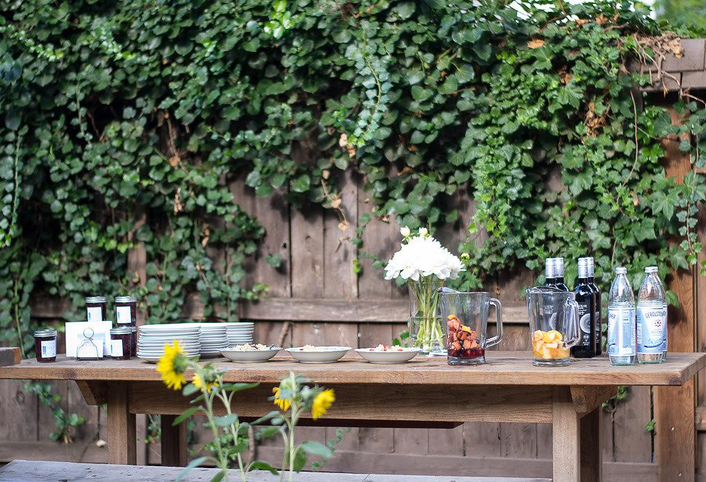
for this event in particular had a kick-ass new producer, jessica yelas of the styleopal who called in the most amazing friends and talent. we had a workshop leader, erin libby who wrote the most beautiful activities, dr. jj purcell of fettle created and share her flower essence with us. wendy westerwelle knocked us out with hysterical wisdom and truths about living in gratitude, ale cassafranco of viola x cas and i came together morning of and created the tablescapes - organically, without previous discussion it was my favorite of any i had ever participated in. it beat every wedding i have done to date. my grandmothers blue and white china, and my selected rentals combined with her greenery and flower selections looked amazing. bottom line, selecting vendor partnerships, reaching out to the community and sharing the mission are all equal parts of the equation. it's a special practice to be vulnerable and ask for support and involvement.
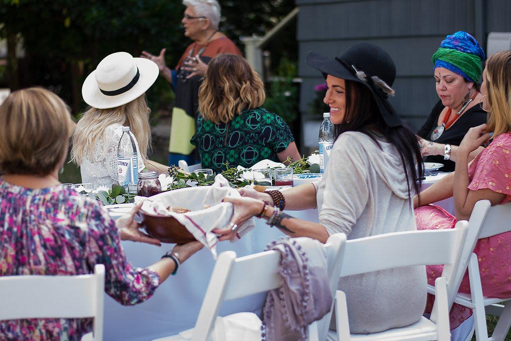
annika bielig-bußmann // full moon supper club pdx july 2016
cultureisland: how do you hope to evolve full moon in the future?
caroline griffin: full disclosure, after years or doing this and many sharp turns, i am going to re-brand the experience and start something new - similar in structure, but a new "brand" and name that builds on what the experience has been up 'til now. i am going to be diving head first into business partnerships and find ways to learn and grow with funding! there are event spaces being founded in pdx, groups being formed that make this project all the easier to catch on and create with.
adults generally dislike learning new things, it's an uncomfortable and annoying part of being in my infancy in this business venture. i have to do homework and find ways to reach a greater audience, discover design avenues to aesthetically match my vision and my mission. i am going to stick my nose to the grindstone and into my accounting books and find ways to save money. i learn as i go and business marketing is not my strength, creative concept is. i also need to find a strong team that works well together and demonstrates the values, the mission in their life, not just agrees with it cause girl power and feminist goals are buzz words and they lack friendship. i am going to partner with rad creatives (women and men) and make experiences that people are excited to be a part of.
annika bielig-bußmann // full moon supper club pdx july 2016
cultureisland: what inspires you to create experiences and pursue passion projects?
caroline griffin: i want to love hard, cultivate the healthiest body and relationships i can, and that's it. everything else is a bonus. i want other people to feel loved, feel happy, feel inspired and feel good feelings. that is the pretty way of expressing what inspires me. i want to pursue things that spark my heart. the real truth, i hustle hard to create things because i have always had tough or super lame day-jobs, soul-sucking paying gigs that really bum me out. working in education, the legal system, office work that in most respects makes it hard to get out of bed and motivate. the goal which i believed in for so long is to have your passion be your paycheck, but for most that will not happen and we cannot convince people that if they don't make that happen, their work is less important or significant. that is an entitled and negative perspective.
i do not have the luxury not to work, and i truly believe that no matter what your job is, it does not define who you are, who i am. that's some twisted societal b.s. willie nelson sold vacuum cleaners. erykah badu was a waitress. i mean, what you do at any point in your life for a dollar does not define who you are. it can absolutely feel that way and some days when i tell people what i do, i cringe inside. i am grateful for work, period and never take employment for granted
i need to pay for my life and support my family and pup. i find it humbling to go to a job 40+ hours a week and do my best, and my passion projects allow me to release my creativity, and positivity into the world in my free time. i create projects to keep me even keel, and help me remind myself that the world is plentiful and it's just a matter of time before i figure out the right recipe to not work for someone else.
cultureisland: who are your favorite artists?
caroline griffin: georgia o'keeffe - were both from the land of enchantment, new mexico. shes been a icon of mine since i was young. james turrell - <3 no words. he's has an indescribable gift and intelligence. plus, petra collins and adwoa aboah.